If you are a business owner looking to grow your business online, here are three important facts:
- Today more people are accessing the web on mobile devices more than they do on desktop and laptop computers – and this number is growing.
- For both business-to-business (B2B) and business-to-consumer (B2C), not having a website that’s easy to access on mobile devices can hurt business.
- Search engines are promoting mobile-friendly websites and penalizing websites that are not. In fact, Google is aggressively promoting a mobile-first approach, has created a separate mobile index and is developing a number of technologies focused on mobile devices like Accelerated Mobile Pages (AMP) and Progressive Web Apps (PWA).
Your target audience is mobile – Your website needs to be mobile too!
In today’s mobile-first ecosystem, responsive website design (RWD) increases traffic flow, search engine ranking, and online sales. It also maximizes return on investment (ROI) for businesses with an online presence. Read on to understand what RWD is, how it works, and how to implement it for your business to gain an advantage over competitors who do not use it.
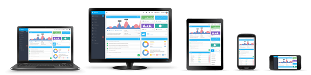
What is responsive website design?
RWD gives users a seamless experience when visiting the same site from multiple devices. This means that someone can visit your website on a desktop, than access the same site from a mobile device. It eliminates the need to maintain a desktop site and a mobile site. Brand identity and user experience stays consistent because the content scales to the appropriate size for the platform, screen size, and orientation of the device.
Responsive web design uses a variety of elements to achieve this fluidity, including:
- A combination of flexible grids and layouts
- Resized or cropped images
- CSS media queries
This enables users to switch from a laptop to a tablet to a smart phone without compromising design integrity or website appearance.
Difference between standard and responsive web design
With standard web design, users transitioning from a laptop to a mobile device must be redirected to a second, mobile site. Thisredirection splits traffic to the same page from computers and mobiles and complicates analytics. With RWD, multiple CSS style sheets are used to create breakpoints for each device. This means that mobile and PC users visit the same website. Brand identity and site aesthetics remain consistent between the two versions because the site automatically switches between styles based on the user’s device, screen size, resolution, and browser.
How to create a responsive website
To create a responsive site, you need some knowledge of cascading style sheet (CSS) coding. If you are not familiar with programming language, you can hire a web design firm with programming experience. Whether you invest in learning basic programming skills or employ a programmer, you still need to be familiar with the principles of responsive design. This information will help you format content and communicate your needs effectively. Use these tips to optimize breakpoints, font, and content.

Start small and work up to choose major breakpoints
A breakpoint is the pixel width at which your website will switch from a larger computer CSS to a smaller mobile CSS or vice versa. To set major breakpoints, make sure your website looks good on the smallest mobile screen first, then scale up device formats. Choosing a major breakpoint is somewhat subjective, but you will know it when you see it. Too much white space between elements is an indication that a breakpoint is necessary.
Major breakpoints focus on a single transition, so think in terms of moving from a laptop to a tablet. You may discover that your website loses cohesiveness once you move beyond 600 pixels. In that case, you would set up a larger style sheet for screens above 600 pixels, and a smaller one for device screens below the threshold.

Use minor breakpoints to improve user experience
Minor breakpoints are not always necessary, but they can be helpful. For example, when you have enough room, boosting font size and enlarging icons improves readability and makes interaction easier. If your website includes an online marketplace, these elements are even more significant.
Again, start small and work up. Minor breakpoints address several transitions, so you can focus on font enlargement on very small screen sizes, then adjust icon size if you have more room on a different device. You can also play with margins and white space to make sure that user experience is optimal.
Optimize text for easy reading
Ideally, a column of text should contain 70-80 characters per line, which is roughly 8-10 words per line in English. Consider creating minor breakpoints to keep lines of text at this ideal width. This technique not only improves the appearance of your website, but it also makes it easier for visitors to track and read. A lot of browsing behavior takes place on autopilot. In other words, we will instinctively gravitate toward content that is easy to parse, and away from content that is harder to track. Improving readability helps retain users, improving sales and opt-in rates.
Avoid hiding content
It is frustrating to access content on a website, than discover that you cannot access the same content from a hand-held device. Find ways to keep links and other navigable elements in the same relative positions whenever possible. In some cases, a lack of information can create other problems. If your visitors cannot find the information they seek quickly and easily on your site, they will go somewhere else.
Also, keep in mind that mobile users are accustomed to scrolling up or down. Forcing them to scroll from side to side or pinch and zoom results in a negative experience; which translates to a negative impression of your company.
Advantages of Responsive Website Design
Statistics indicate that over half of social media consumption occurs on mobile devices. Also, a whopping 80 percent of consumers shop online from their mobile phone. With statistics like these, it is no wonder that Google recommends mobile-friendly web design to boost your website’s search engine optimization (SEO). Look at some of the other benefits mobile-friendly responsive web design offers.
Improved ROI
As a business owner, it is important to invest in ideas that make you the most money. A responsive site cuts costs in two areas: mobile development and site management. When you have two websites, you incur double the costs. Using RWD means you only have to maintain one website.
You also save time with responsive website design. Since everything is contained within a single site, you can use a single interface for website administration. Changing templates, content, or layout is much easier when you do not have to juggle between a desktop and mobile site.
Better sales and conversion rates
Multiple sites can create barriers to brand cohesiveness in functionality, aesthetics, and performance. Responsive website design lets you use CSS to develop a standard look and feel to your site. When your brand maintains a consistent identity across multiple platforms, it is easier for users to browse and shop your website.

Consolidated analytics
When you have a mobile site and a desktop site, you have to design different click funnels for each site. It is also difficult to integrate analytics from both sources to discern traffic patterns. Since RWD combines both versions in one site, there is no need for separate marketing campaigns. You will also tell how visitors enter your site and what they do without unnecessary number crunching.
Responsive web design is a worthwhile investment as it offers so many benefits. From versatility and functionality to improved sales and SEO, RWD provides better performance and reliability for websites. Flying Cow Design’s responsive web design services can help you plan and implement a website that offers consistent user experiences regardless of the device — computer, mobile and tablet.
CEO, Flying Cow Design
Attended University of Auckland
Lives in San Francisco Bay Area