Choosing which website layout to use, liquid, fixed, elastic or hybrid, is something all web designers struggle with at some point during the web development process. The final decision is made on how flexible the website will be for the user. Each layout has advantages and disadvantages.
Some of the major decision factors are:
- Resolution
- Browser
- How the website looks when the browser is maximized.
- How many toolbars are open making the screen larger or
- Which operating system and hardware are being used.
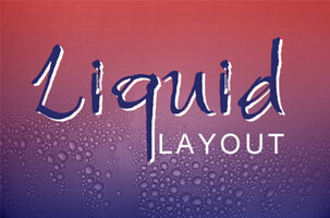
What is Liquid Website Layout?
The liquid website layout, also known as flexible or fluid layout, when the content of the site can be resized to fit the screen depending on its resolution. Resizing a website to meet the resolution is also called responsive website. Using Cascading Style Sheets (CSS) to design your fluid website will help reduce the requirement to scroll down a web page to see content. Though liquid layouts have many advantages, there a few disadvantages as well. Given below are some of the advantages and disadvantages of using liquid website layouts.
Advantages of Liquid Website Layouts
Liquid Layouts are User-Friendly
Internet users can easily become annoyed when they have to scroll down website pages to find the information they are looking for. Many times, parts of a web page are left blank due to the high resolution of the screen making the site visitor scroll down the page to read the content. Liquid layouts help minimize such scenarios. Since liquid layouts are meant to make content fit according to the size of the user’s screen, the content can be rearranged to fit the width of high resolutions, thereby reducing the requirement to scroll up and down the pages.
Liquid Layouts are Appealing to the Eyes
It is not easy on the eyes to see a page with inconsistent spaces. If you use the liquid layout to design your site, then all the empty spaces on the screen will look consistent on all browsers, and therefore, will appeal to your user’s site.
Eliminate Horizontal Scrollbars using a Liquid Layout
One problem a web designer faces with a fixed width layout is the horizontal scrollbars. These scrollbars may appear if the resolution of your user’s screen is lower than the resolution your site was designed. However, since the content will rearrange itself to fit the resolution of the user’s screen, this problem may not appear if you use liquid layouts.
Disadvantages of Liquid Layouts
With liquid layouts, you have less control over the look of your site
Web designers should be concerned about how the liquid website will appear on extremely high or low-resolution screens. If the site does not appear correctly, it can cause a bad user experience creating an adverse effect on your Google Analytics results and search engine ranking.
Liquid layouts can cause trouble for flash, video, etc.
It is not possible to resize all elements of a website. Most times, videos, images, and other elements like flash media come in fixed sizes that cannot be changed. For example, if the website’s masthead is made in Flash, then it would have to be designed in a specific size only.
Liquid layouts may not look very good on screens with high resolution
If a site that is created using a liquid layout is viewed on a very high-resolution screen, it can make the white spaces on the page look larger than they actually are, thereby taking away all the visual appeal from the site. The white spaces can also look like the site has very little content.
Liquid website layouts can cause readability problems
The width of a column of text can become wide on high screen resolutions making all the lines look very long and making it difficult to read. Similarly, the width of the text columns can become very narrow on low screen resolutions also making it difficult to read.
Liquid layout can lead to printing problems
It can become difficult to print a default page that was designed in liquid layout. This problem can be solved by adding separate print style sheets to print the pages. But this means another step will get added in the entire process that needs to be managed.
Hybrid Layouts – A Mixture of Both the Layouts
Websites can be designed using a combination of both the fixed width layout and the liquid layout. Most of the website elements will have to follow the fixed width layout, however, some of them can use the liquid layout. Using a combination of both the layouts will ensure the site looks good and visually appeals the users on all screen resolutions. Such a design will ensure there are no empty spaces in the middle of the page like the ones found in a liquid layout, or on the sides like the ones found in a fixed width layout. Due to this convenience, many web designers are now choosing hybrid layouts which are a combination of both the fixed width layout and the liquid layout.
How to Choose the Best Resolution for Your Screen?
Your web designer will decide on the width of the screen on which the content will appear, even if the site is being designed in the fixed width or hybrid layout. To do this, the web designer will need to research the most common screen resolution of the target audience for your website.
You can find this information on the global screen resolution statistics that are given by websites like W3Schools. In some cases, if you already have a website and you are planning to redesign it, then you can take a look at the statistics of the users who visit your site to determine the most common resolution.
For more questions on website layout design contact Flying Cow Design today!
CEO, Flying Cow Design
Attended University of Auckland
Lives in San Francisco Bay Area